Lets delve into the transformative world of lean charts for lead time, capacity and resource balance.

Through this presentation, we'll guide you on how leadership teams can utilize these charts to effectively interpret maps. Additionally, we'll explore the benefits of What-if studies and showcase eVSM as an instrumental communication tool, bridging the gap between insight and continuous improvement.

Our presenter, Nancy Such brings her 35-year experience from the Medical Device Manufacturing sector. A Lean Six Sigma Black Belt and Certified Lean Professional, Nancy specializes in value stream mapping and digital transformation. Today, she'll share insights on various VSM charts, with a special focus on her favorite resource balance chart.

Today we will focus on analyzing maps with charts so we can build our future state.

If you recall the first in our series was launching a line and achieving balance with Digital Value stream mapping. For today's presentation, we will be using the same case study and maps as we did in the first. It's available on Nancy's website if you need to reference back to it.

The "Learning to See" workbook by John Shook and Mike Rother remains a cornerstone in understanding VSM fundamentals, even after 20 years. eVSM has integrated these time-tested principles with modern capabilities, such as managing multiple products on one map and using automated charts for enhanced visualization.

My first introduction to charts

Where do we start? We almost always begin by Sticky note Value Stream Mapping by functions. These orange tags represent functions such as supply chain, operator, finisher, inspector, and shipper. And below that is the legend of what these colors represent.

The product matrix feature in eVSM simplifies the mapping process. By clicking a button, products are imported, and corresponding map activity shapes are generated. This saves time for the mapping team and ensures clear visuals for everyone viewing.

While map authors grasp their detailed maps, charts simplify this information for broader understanding. As maps incorporate more operational data, they can become intricate. Charts offer clarity, highlighting bottlenecks and aiding in Kaizen identification. This visualization aids in prioritizing improvements, helping both the map authors and leadership align on next steps..

Within eVSM, there are many charts. The chart you choose to plot depends on your business problem.

Cycle Time/Takt Time Chart
This chart displays the link between task completion time and the needed production rate. By comparing cycle time with takt time, we can assess how well a process meets customer demand and pinpoint areas for efficiency improvements. It's a straightforward tool for understanding process pace in relation to customer needs.
This chart displays the link between task completion time and the needed production rate. By comparing cycle time with takt time, we can assess how well a process meets customer demand and pinpoint areas for efficiency improvements. It's a straightforward tool for understanding process pace in relation to customer needs.

Understanding the Cycle Time/Takt Time Chart
For mixed model maps, considering the varying demand and different cycle times is essential. The chart uses the Weighted Average Cycle Time (WACT) for comparison against the takt time. WACT values below takt time indicate sufficient capacity processes, while those above signal a production pace that can't meet demand. eVSM also incorporates production losses into this analysis.
For mixed model maps, considering the varying demand and different cycle times is essential. The chart uses the Weighted Average Cycle Time (WACT) for comparison against the takt time. WACT values below takt time indicate sufficient capacity processes, while those above signal a production pace that can't meet demand. eVSM also incorporates production losses into this analysis.

Takt Time vs. WACT for Machining Activity
Inputs:
Demand: 1750 items/week
Available Time: 120 hours/week (432,000 seconds/week)
Takt Time: 432,000 seconds 1750 items = 247 seconds/item.
For our machining activity, the WACT is 230 seconds, which is below the takt time of 246.86 seconds. This indicates the machining process can meet the given demand.

Impact of Increased Demand on Takt Time & WACT
Updated Demand: 8500 items/week.
New Takt Time: 432,000 seconds 8500 items = 51 Sec/item.
With the sharp increase in demand, the takt time drops significantly from 247 seconds to just 51 seconds. The WACT for machining now stands far above this reduced takt time, being almost 5 times the new value. This discrepancy signals a pressing need for capacity adjustments. Utilizing what-if studies can provide insights into required capacity changes to meet the heightened demand.

How do we increase the capacity to meet the new demand?
Short Term Action to Address Demand
To address the demand surge, one immediate action is increasing the planned production from 5 days a week to 7 days. This adjustment results in the Activity Takt time (represented by the red line) rising to 71 seconds and narrows the gap between demand and capacity. We will need additional changes.

Capacity at Machine meets the new demand once the station count is increased to 10. That was a big jump and took many months but once we got there, we were able to go back to the original staffing plan of 24 hours day/5 days week to reduce the overtime costs.

Forecasting Fluctuation in Demand
To better prepare for demand unpredictability, it's pivotal to play with takt time using forecasted demand percentages:
Demand 1: Adjusted to 90% of the original.
Demand 2: Increased to 110% of the original.
By plotting these variations on a chart, we visually represent potential fluctuations, aiding in proactive planning. This visual tool assists in aligning operations with possible future demand scenarios, ensuring consistent alignment and capacity readiness.

Resource Balance Charts

Let's walk through how to generate a chart. You drag out the chart from the stencil on the left and right-click to plot it

Resource Balance Chart
The Resource Balance Chart offers a clear visual of both resource allocation and availability. This visualization becomes a powerful tool for effective resource management. Through it, one can quickly pinpoint bottlenecks or imbalances within the process, streamlining operations and ensuring optimal utilization of available resources.
The Resource Balance Chart offers a clear visual of both resource allocation and availability. This visualization becomes a powerful tool for effective resource management. Through it, one can quickly pinpoint bottlenecks or imbalances within the process, streamlining operations and ensuring optimal utilization of available resources.

We can consider changes to balancing the available resource within the value stream.

Plotting the idea of assigning Operator to mass finish and next activities

Lead Time Chart
The Lead Time Chart is a visual tool that illustrates the span between the start and end of a process. Not only does it highlight the overall duration, but it also segments the time into Value-Added and Non-Value-Added phases. This differentiation offers a transparent look into areas of value and potential waste, paving the way for focused improvements.
The Lead Time Chart is a visual tool that illustrates the span between the start and end of a process. Not only does it highlight the overall duration, but it also segments the time into Value-Added and Non-Value-Added phases. This differentiation offers a transparent look into areas of value and potential waste, paving the way for focused improvements.

How is the chart read?

Interpreting the Lead Time Chart
The Lead Time Chart uses distinct color-coded bars to break down the process:
Value Added Time: Represented by the dark blue bar.
Non-Value Added Time: Denoted by the orange bar.
Inventory: Captured in the red bar.
It's worth noting that occasionally, the Value Added (VA) time might appear minimal in contrast to the Non-Value Added (NVA) time, leading to it being overshadowed. Predominantly, the heightened NVA durations arise due to inventory factors, whether it be Raw Material (RM), Finished Goods (FG), or Work In Progress (WIP).
For a more granular understanding, the time summary also provides a percentage breakdown, showcasing VA's contribution to the overall lead time. This allows for a clearer insight into where efficiencies and inefficiencies lie.


As we reflect back to our Acme end caps case study we see that at our Current State of 1750 pieces per week the total lead time was under 3 weeks.

The surge in demand, from 1,750 to 85,00 was managed by ramping from 2 to 10 machines, adding appropriate staffing and adjusting WIP levels. The implemented changes should have been enough to maintain the 3-week lead time, but it crept up to 8 weeks without an assignable cause. What happened to our plan?

We discovered that we missed that our inspector was overutilized and the inspection had no WIP cap:
Inventory grew, resulting in 6 weeks of stock.
Downstream processes faced disruptions due to excessive inventory.
The inspector's workload reached 135%, indicating an imbalance in resource allocation.
These factors emphasize the importance of proper WIP management and balanced resource distribution.

To address the immediate challenge of the overburdened inspector:
The number of inspectors for QC was increased.
This temporary solution aims to manage the inspection workload more effectively and ensure quality checks are not compromised.
The number of inspectors for QC was increased.
This temporary solution aims to manage the inspection workload more effectively and ensure quality checks are not compromised.

For a sustainable and effective solution in the long run:
Inspection labor hours were extended, dedicating 50 hours a week up from the previous 35 hours.
The Inventory WIP cap was strategically extended to encompass QC, ensuring smoother transitions and effective quality checks.
These long-term strategies are designed to maintain quality, manage workload efficiently, and keep operations running smoothly, even with increased demand.

Achieving Targeted Lead Time
With the implemented short-term and long-term measures:
The lead time was successfully reduced to the targeted 3 weeks, even amidst the heightened demand.
These strategic adjustments underscore the importance of agile resource management and process optimization, ensuring that even in the face of surging demand, operations remain efficient and delivery commitments are upheld.

The Capacity/Demand Chart not only reveals available capacity and demand but also serves as a lens to identify lean wastes within the system. By examining the gap between capacity and demand, potential areas of waste like overproduction, waiting, and underutilization become evident. This visualization aids in directing efforts towards waste reduction, optimizing resource allocation, and achieving a leaner and more efficient operational model.

Decoding the Capacity/Demand Chart
Understanding the Capacity/Demand Chart involves deciphering its elements:
Effective Capacity (Solid Blue Line): This line reflects the true capacity after accounting for losses.
Capacity Losses (Stacked on Top): Stacked above the effective capacity line, these represent factors contributing to capacity reduction.
Sum of Good Parts (Solid Red Line): Depicts the customer demand for your product or service.
Activity Center Capacity (Green Bar): The green section above the red line indicates extra capacity beyond the actual demand.
This chart provides a comprehensive snapshot of capacity utilization, losses, and the alignment of production with customer demand, aiding in efficient resource management and waste reduction.

Dashboards helps to compare current state and processed future state.

Compare charts with dashboard utility in eVSM.

Tips to edit charts.
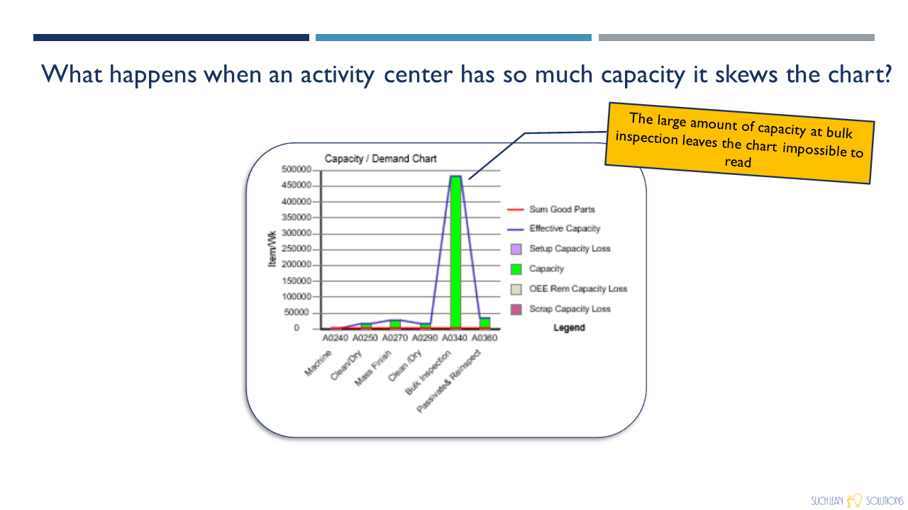
Bulk inspection shows huge capacity and it can be neglected in the chart by using the chart control function.

Color code the tag.

Go to edit chart data.

Uncheck the color tags option to neglect the inspection activity.

It neglects the bulk inspection activity making more clear capacity visualization at other activities.


Thank you for being a part of this insightful session. We're excited to continue our journey towards operational excellence with you. Have ideas for our next webinar? We'd love to hear them! Reach out to us at nsuch@suchleansolutions.com or support@evsm.com and share your thoughts. Stay tuned for more valuable insights and collaborative learning experiences.